Browsing Category

Visual Arts

Homecoming / Homegoing: Weaving Expressions of Community, and Healing at the Phillips@THEARC

By Oluseyi Akinyode

This article was originally published in DCTrending here.

Before visiting Zsudayka Nzinga’s Homecoming / Homegoing exhibition at Phillips@THEARC, I regarded fabrics merely as a collage component. The six artworks on display by Nzinga showcase the expressive power of textiles, where fabrics serve as frames, depict figures and vegetation, create landscape backdrops, and convey concepts of meaning like grief. 

I was struck by how the fabrics extended beyond the traditional framing, reflecting Nzinga’s intention to mirror the ongoing effects of past events in America’s history. In several artworks, Nzinga focuses on outdoor scenes, a departure from her past themes centered on family and interior spaces. This exhibition broadens Nzinga’s body of work and engages viewers in conversations about America’s founding history and its complex intersections with the Black experience.

In Run Away But Come Back Petit Marronage Act 1, the artwork depicts two Black men at a plantation. Behind them is a cabin with a red, blue, and white striped roof set against a starry navy sky fabric. With a comforting arm around the first, the man on the left looks calmly out to the plantation. The man on the right looks towards the horizon with a sad expression. To the right, five men are cast in varying silhouettes of the American Flag. A fabric of red and yellow flowers frames the entire scene. The artwork Run Away But Come Back Petit Marronage Act 2 portrays a similar scene with women as the central figures.

These artworks explore Petite Marronage, a form of resistance where enslaved people briefly left plantations before returning. These escapes were crucial acts of self-care, allowing them to assert their autonomy despite harsh conditions. Many returned because of family ties and the sense of home. The sentiment is poignantly expressed through the fabrics of red and yellow flowers that cover the slave cabins. Nzinga frames the scene with motifs of stripes and stars, juxtaposing America’s ideals with its practice of slavery. The artworks serve as visual narratives, echoing Nzinga’s desire to “use her collage paintings as counter-narratives that address gaps in America and art history.” An oral history inspired the Petit Marronage series passed down in Nzinga’s family.

In The Domestics, Nzinga continues her interrogation of America’s history through a group portrait of adults and children in front of a building made with striped fabrics. Figures are rendered in fleshy tones of acrylic, while others appear as black-and-white scribbles, or silhouettes. Though the portrait seems innocent, its meaning is far from benign. Nzinga based this collage on a historical photograph of slaveholders and enslaved workers serving as symbols of wealth.

This piece invokes earlier critiques of displays of wealth in the art, such as Thomas Giansborough’s Mr & Mrs Andrews. Just as Gainsborough unmasks the exploitation behind the English gentry’s opulence, The Domestics exposes the abuse underlying the American Slaveholder’s wealth. Nzinga renders the slaveholders as silhouettes, casting them into the shadows while highlighting the dignity of the enslaved with focused expressions. This gesture acts as a deliberate act of care, affirming their humanity while providing a sense of home long after their time.

In Sharecroppers Porch, various states of rest contrast with the theme of forced labor in the Petite Marronage series. A woman on an oversized yellow rocking chair and two women chatting suggest moments of reprieve. Nzinga has replaced the foreboding skull-filled doorways and windows from the Petitte Marronage series with colored flowers, symbolizing growth. Despite these moments of ease, Maya Angelou’s memoir, I Know Why The Caged Bird Sings, revealed the harsh realities of sharecroppers in the South: “No matter how much they had picked, it wasn’t enough. Then they would…end the season as they started it. Without the money… to sustain a family for three months,” highlighting their struggles.

Even so, Sharecropper’s Porch shows people finding comfort in their communities and creating a sense of home in the worst conditions. As Nzinga shared, “There’s something different about picking cotton for yourself rather than for others. For many, sharecropping was a way for Black families to sustain themselves and build businesses.

Two artworks in the exhibition, Never Lose Me and What Remains, signal a shift in Nzinga’s portrayal of grief from a physical to an abstract representation. In Never Lose Me, a young boy in a rose-red cloth with his eyes closed tightly embraces a formless figure made from marbled fabric. The boy’s arms and hands are more prominent than usual, with his right hand merging into the figure’s body. The figure, visible only from the back and unresponsive to the embrace, takes up most of the composition, enveloping the canvas. The defined black outline of the boy’s body in acrylic flesh tones contrasts sharply against the figure’s shapeless form. The rest of the canvas is filled with blue floral patterns.

The scene explores themes of grief, absence, and presence. The boy’s exaggerated arms symbolize his efforts to hold onto someone gone, reflecting the emotional struggle of dealing with loss. Although the figure is not physically present, their presence permeates the canvas, dissolving everything in its wake. In a shift from her past practice, Nzinga created the marbled fabrics used in this artwork, reflecting her desire to experiment with fabrics and their materiality—how their texture, weight, and interactions with other fabrics affect the visual impact of her works. 

The exhibition showcases how collage can express seemingly contradictory ideas, demonstrating that acknowledging one truth does not negate another. Nzinga’s collage paintings confront past injustices, reminding us that our histories continue to shape the present. They show that only by confronting the past can we move from grief to genuine healing. 

The exhibition Homegoing / Homecoming is on view at Philips@THEARC through September 26th, 2024. Admission is free.

Potomac River Shen Series At Union Station: A Panorama Of Ecological Landscapes

By Oluseyi Akinyode

This article was originally published in DCTrending here.

At Washington, DC’s Union Station Amtrak railway waiting area, you’ll come across a series of murals spanning the upper walls from Gate A through L. The murals entitled The Potomac Shen River Series, were created by local artist Katherine Tzu-Lan Mann. They’re the second installation of Art at Amtrak at Union Station, part of Amtrak’s initiative to revitalize the station and enhance the travel experience for its visitors.

For Mann, Union Station is more than a transit hub—it’s a beautiful place full of vibrant energy. She relished the opportunity to create meaningful art in public spaces. Mann’s installation, rendered on vinyl, consists of three murals that vividly depict the Potomac River’s landscape teeming with botanical and animal life. Created initially with a poured ink technique on paper in the artist’s studio, the painting was photographed and then digitally manipulated to cover the station’s upper walls. 

The Potomac Shen River Series follows the inaugural installation, A Great Public Walk, by multidisciplinary artist Tim Doud. Doud’s work reflected and celebrated the myriad of clothing styles, patterns, and logos Union Station visitors wear. In contrast to Doud’s emphasis on the human aspect, Mann’s installation shifts focus to the natural world, specifically highlighting the Potomac River. It’s a local landmark that oftentimes goes unnoticed despite its familiarity.

In our interview, I asked Mann what motivated her to select the Potomac River as the mural’s subject. Mann wanted to shift perceptions about the river, noting, “The river, for people, has a reputation as something dirty and full of trash. And it’s so much more”. She views the river as the lifeblood of the district. The Potomac River is the sole water source for the District and Arlington while forming part of the border between D.C. and Maryland. 

The Potomac River Shen Series showcases Mann’s passion for murals. The horizontal format perfectly portrays the expansive ecological landscape of the river. Unlike traditional landscapes, the murals unfold as viewers walk alongside them, revealing intricate details with each step. This interactive experience evokes the narrative progression found in Chinese scroll paintings. The murals’ vastness also encourages piecemeal viewing, prompting commuters and station employees to discover new details with each passing glimpse. This multi-viewing experience, where close observation unlocks hidden details, mirrors the essence of Chinese landscape art.

The first mural, a massive 150 feet by 10 feet high, covers the space between Gates A and D. It features a densely packed cacophony of colors—yellow, red, blue, orange, red, and purple. At its center are two plain freshwater clams, their shells adorned with multi-colored vertical stripes. Long, swirling tentacles extend from their bodies, surrounded by native Potomac plants such as cypress, oak, water lily, and lotus. 

The landscape unfolds across a horizontal scroll, sweeping from left to right, creating an immersive experience. Abstracted forms of cloud rafts, evoking floating magical islands in Buddhist iconography, add an otherworldly dimension to the landscape. Intentionally placed shapes and intersecting lines add structure to the dynamic scene. 

The clams at the mural’s center also reference the Clam Monsters known as ( 蜃 Shen) in Chinese folklore. Each clam monster is separated by a line running down the length of the mural, symbolizing a mirror. The landscapes mirror each other. Each world is simultaneously real and imaginary. Despite its intricate complexity, the composition achieves balance through repeated forms.

The second mural between Gates E and G is slightly shorter at 113 feet. It continues the core motif from the first mural but with some distinctions. The composition here is less densely packed, featuring four clam monsters with shells in shades of magenta and yellow. The plant life depicted includes water lettuce, pond lilies, lotuses, and cherry blossoms, with a more limited color palette of aquamarine and greenish-gray hues. Mann took a more subdued approach to this mural’s composition, creating a different rhythm in the viewing experience. 

The third mural, measuring about 99 feet, covers Gate H through L. It carries the subdued colors of green and gray punctuated with white space. This piece continues the visual narrative of the first two murals depicting water lilies, grasses, lotuses, maple, oak, and the clam monsters. This series of murals celebrates the ordinary organisms inhabiting the Potomac River by depicting animal and plant life within abstract forms.

Mann’s background significantly influenced the aesthetic of the murals. As a half-Taiwanese woman raised in various countries due to her father’s Foreign service career, she developed a fascination with juxtaposing disparate styles. This influence is evident in her murals, which combine decorative patterns, abstract forms, and iconography, creating a dissonance that adds an intriguing depth. The use of fantastical elements, such as the clam monsters, is rooted in her interest in Chinese Mythology. 

Her early training in sumi ink painting, a traditional Chinese art brush technique, sparked an interest in landscapes and shaped her depiction of them. Her murals also reflect a fascination with the interplay of chance and control, inspired by abstract expressionist Helen Frankenthaler. Mann’s deliberate placement of lines echoes techniques used by painter Morris Louis. 

Given the murals’ rich iconography, I wondered if transient visitors to the station might miss its intricate details. She shared that it was okay if visitors didn’t understand the symbolism in the art piece. Her goal was for visitors to find a sense of serenity amidst the bombardment of commercial signs at the station and get transported to other worlds they might not otherwise access.

The Potomac Shen River Series is on view at Union Station until September 2nd, 2024.

Intimate Moments: A Look At Sydney Vernon’s Interior Lives At Philips@THEARC

 By Oluseyi Akinyode

This article was originally published in DCTrending here.

Our lives are an amalgam of ordinary moments and significant events. Interior Lives, an exhibition featuring works by up-and-coming local artist Sydney Vernon at Philips@THEARC captures the subtleties and complexities of these experiences. Vernon was invited by Philips@THEARC to showcase her works in dialogue with Bonnard’s World, a retrospective of Pierre Bonnard’s body of work at the Phillips Collection. 

This collaboration with Vernon is particularly fitting given her exposure to Bonnard’s work during her formative years and her ties to the area. The exhibition at Philips@THEARC is part of a wider initiative between The Phillips Collection and its partners to extend programs to communities and foster collaboration with local artists.

Interior Lives features six of Vernon’s drawings on paper, two in black and white and the rest in color. The artwork that drew me right in is Prinita in Park Slope Apt. It depicts a woman enjoying a cigarette by the window, her eyes closed in bliss. A loosely drawn curtain hangs over the window sill, framed by leaves from a nearby potted plant. 

Although it’s a simple pencil sketch, it deftly conveys the essence of the fleeting moment, making it a striking piece. There is a sense we are privy to a glimpse because Vernon has captured it on paper. The paper’s serrated edge accentuates the moment’s brevity, almost as if the scene has been ripped from a snapshot of someone else’s life. The loose and fluid style of the drawing is ideally suited to the paper medium.

As a newcomer to Vernon’s work, I was curious about her choice of drawing as her primary medium over more traditional ones like paint. Vernon explained that paper is more accessible and conducive to jotting down ideas. She noted, “I can be on the train with my sketchbook and quickly sketch out an idea.” The immediacy of paper aligns well with her rapid and spontaneous creative process; she tends not to plan or overthink how a piece will unfold once she starts working on it.

It would be remiss to assume Vernon’s artistry revolves solely around elevating mundane moments to studies of contemplation. A native of Prince George’s County, Sydney Vernon studied Fine Arts at The Cooper Union in New York City. Vernon’s artistic practice involves overlaying family photographs with imagined histories and futures to create forms with new meanings.

This fusion of history and memory holds deep significance when viewed through the lived experience of Black people in America. This shared history is characterized by resilience and the triumph of the human spirit. Vernon desires for her art to reflect this spirit. She observed that each generation of her family was marking new milestones, surpassing the dreams of their predecessors, who often contended with a limiting socio-economic environment. Vernon’s approach to overlaying her images goes beyond a mere poetic reconstruction of her ancestors’ imagined lives. It becomes a powerful tool for consciously framing her world, transforming her art into a medium for personal and cultural expression.

Coastal Ride, a charcoal drawing on paper, features the artist’s aunt on a motorcycle, her smile visible beneath her sunglasses. The charcoal medium adds texture to the work. The composition, with the aunt against a vast landscape, evokes a sense of freedom and possibility. This piece is not just about the joy of engaging in a hobby but also a testament to the private moments of human life. Like Vernon’s other works, Coastal Ride exalts the beauty of everyday Black lives, in stark contrast to the tragic depictions and stereotypes often perpetuated in the media. 

Continuing the theme of intimate moments is the artwork Vacation, created with pastel and silkscreen on paper. Using a family vacation photograph as source material, the artist overlays an urban landscape with an imagined bridge. Her mother, wearing a sky-blue swimsuit, stands waist-deep in swirling waters of turquoise and blue. Her eyes are half closed as she enjoys the moment. Against a backdrop of vivid green mountains is a sky bursting with bold red, white, and yellow patches. The artist takes a similar approach in Hide and Seek, another drawing portraying the artist’s mother in the family living room against a purple, yellow, and blue background, framed to the right by green foliage. 

Both artworks, Vacation and Hide and Seek, stand out not only for their bright colors but also because of their familiar portrayals of objects in unfamiliar tones, equipping the viewer with new ways to see. More importantly, color also serves as a channel for expressing human emotions, reminiscent of the intense feelings conveyed in Mark Rothko’s 1950s paintings, with their horizontal bands of color. Vernon’s artworks are influenced by the post-impressionist French artist Pierre Bonnard. There are the brightly saturated colors, how Vernon frames her scenes with plants, and the portrayal of intimate moments.

Vernon takes Bonnard’s technique of using color to obscure his subject matter and takes it in a new direction by revealing their facial expressions, making a powerful statement about her subjects’ inner worlds. Often, societal perceptions overshadow the true essence of black individuals, treating their bodies as a filter through which to view them. Vernon’s artworks envision a world where Black individuals’ full expressions and inner emotions take prominence.

Finally, we come to the pivotal events of life in The Real Strange Thing, rendered with pastel on paper. The artwork depicts the artist’s parents in a slow dance on their wedding day, dressed in white attire. The chief bridesmaid and best man are positioned to the right, clothed in shades of magenta and gray, respectively. A crowd of onlookers, faces devoid of expression, fill the wedding hall in hues of reddish-pink and bluish-gray. The artist’s mother, gazing at the viewer, holds our attention. 

Conversations with Vernon and her mother revealed that the bride’s face in the drawing is that of her mother in the present. In The Real Strange Thing, the artist tackles themes of past regrets and the enduring consequences of choices. The artwork recalls past events and meditates on the textures of memories and their varying interpretations by individuals. In this piece, the artist journeys across time and space to her parent’s wedding, bearing witness to that day’s hopes and possible fears.

A central message for visitors to the exhibition is the reminder that there is beauty in celebrating both the simple and the momentous. To truly see others, we must peel back the layers that obscure our perceptions to appreciate the richness beneath their lives.

Artomatic transforms abandoned building into a free artistic oasis

 By Abby Stuckrath

This article was originally published in The DC Line, here.

In its latest incarnation, Artomatic once again serves as a beacon of creativity, transforming a vacant building into an artistic hub. From sculptures fashioned from trash in the Potomac to a time-lapse video capturing the Rosslyn skyline, Artomatic demonstrates dynamic, empowering and utterly captivating art that defies traditional form. Running through April 28, Artomatic covers eight floors in a Golden Triangle office building, with the exhibition showcasing the works of over 1,000 artists and performers, ranging from live musical acts to tarot card readings — ensuring there is something to enchant every visitor.

Twenty-five years ago, Artomatic emerged as a liberated space for artists in an abandoned office building at 14th Street and Florida Avenue NW. It was a free-flowing exhibition devoid of a formal curator, where artists wielded the space for their creative voices. The mission of the entirely volunteer-run show remains to “create community, build an audience, and expand economic development by transforming available space into a playground for artistic expression.” After a seven-year hiatus, this groundbreaking art extravaganza has returned to DC, this time hijacking an unoccupied office building on M Street NW.

In this transformative ecosystem of artistic expression, the bounds between creator and audience blur, fostering a sense of community and connection that transcends most traditional gallery experiences. The events at Artomatic range from paint-off competitions to self-exploration workshops, making it not a venue for passive observation but instead a place where individuals become active participants in the Artomatic community.

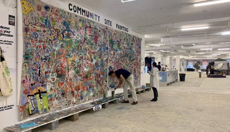
Stepping off the elevator onto the eighth floor — a logical place to start — you’re greeted by a stripped-down building, its structure bare against rugged cement floors. On the northeast side, visitors can unleash their creativity on a community canvas wall with paint and brushes supplied nearby. With the end of Artomatic’s seven-week run fast approaching, the once-blank canvas brims with a kaleidoscope of random squiggles and smiley faces, serving as a testament to the thousands of Artomatic visitors who’ve left their mark.

Turn the corner, and you’ll find art covering every surface. Karen La Du and Jeffrey Blender’s “Adventures in COOKIELand” installation offers an immersive journey saturated with vivid pinks and blues. Their whimsical and abstract sketches evoke a sense of nostalgia reminiscent of the classic style of Keith Haring. 

After walking down the stairs or riding the elevator to the seventh floor, audiences are met with a labyrinth of office spaces, each room dedicated to the work of an individual artist. Natalia Febo’s vibrant neon room, adorned with watercolor depictions of vegetables, fruits and empanadas, stands out as a refreshing oasis amid the darker, gloomier artwork scattered throughout the floor.

On the seventh floor, you’ll also find a room with a continuous stream of films, predominantly in short form. Unfortunately, the quality of these films does not meet the standards set by other art installations. One example is Heritage Film Festival’s short “Birds of the Air,” which feels stiff and lacks the emotional intimacy necessary to effectively portray the story of a transgender woman’s first day presenting as herself.

A standout installation is on the third floor, where Syahidah Osman is showcasing more than a hundred small photo collages adorned with maps and portraits of missing people from East Turkestan who are detained in Chinese Uyghur internment camps. Many victims have had their passports confiscated; they’ve also been assigned to forced labor. Moreover, a large number have vanished altogether. Osman’s artwork is just one of the many pieces across Artomatic’s eight floors that leave a lasting impression.

With each visit to Artomatic, audiences are enveloped in unique art installations that celebrate freedom of expression. Unlike traditional art showrooms, Artomatic is able to provide a platform that empowers artists who might otherwise need more time or financial means to showcase their work. 

By repurposing a demolition site into a place of creativity and freedom, Artomatic uplifts the voices of artists in ways that more conventional museums and galleries cannot achieve. By fostering this collaborative environment, Artomatic encourages audiences and artists to experiment, innovate and push boundaries without the pressure or expectations of a mainstream art institution. Artomatic democratizes access to the arts while making it accessible and relevant to a mass audience. 

This is more than just an exhibition space; it’s a living testament to the boundless nature of human creativity. It’s a place where inspiration is limitless, and the possibilities — for visitors and the featured artists alike — are as endless as the imagination itself. 

Alexandre Diop: Jooba, Jubba, L’art Du Defi, The Art Of Challenge At The Rubell Museum In Washington, DC

By Oluseyi Akinyode

This article was originally published in DCTrending here.

The Rubell Museum is a must-see in DC’s Southwest waterfront neighborhood for those eager to dip their toes into contemporary art. Located in the former Randall Junior High School, the museum offers a unique opportunity to sample the private collection of Mera and Don Rubell. Founded two years ago, the museum reflects the Rubells’ commitment to making art accessible and creating dialogue within the community. 

The Art of the Challenge part of the Alexandre Diop: Jooba, Jubba, L’Art du Defi, the Art of Challenge  exhibit at the museum, showcases five potent works by the French-Senegalese artist. Diop tackles complex themes such as colonialism’s lingering effects, violence, and suffering. While the themes he explores are timeless, his choice of found materials adds a fresh perspective, transforming them into a powerful commentary on the contemporary issues he grapples with.

In Le Mensonge d’État (The Lie of The State), Diop repurposes text, wood, door hinges, and plastic to create a compelling reinterpretation of Olympia, Edouard Manet’s once-controversial masterpiece. Diop engages in dialogue with viewers by incorporating a ripped cover of Civilisation Ou Babarie, a seminal work by African historian and anthropologist Cheikh Anta Diop.

On the left side of the exhibit wall, Honi soit qui mal y pense (Shame be (to him) who thinks evil of it) riffs on Jean-Auguste-Dominique Ingres’s 1812 painting, La Grande Odalisqueanot, echoing similar themes to Olympia. Alongside a series of zig-zag lines, fabrics feature prominently in this composition, with three pieces of velvet-like material in yellow, deep blue, and blueish green serving as the artwork’s background. The fabrics extend slightly off the canvas, creating a sense the viewer has wandered into the subject’s interior world.

Like many early career artists who reference established works, such as Manet’s reimagining of Titian’s Venus of Urbino, the French-Senegalese artist draws inspiration from the art history canon. Taking a subversive turn, Diop asserts his unique perspective by prompting viewers to question prevailing narratives on identity, self, and agency, which is particularly meaningful in Africa’s social and political history. Diop stakes his place in the art world through these references as if to say, “Here I am, too.”

The most striking piece in the exhibition is titled Mondo Carne. It was inspired by the 1962 Mondo documentary, which depicts humans in bizarre situations. Mondo Carne’s scale demands attention, requiring viewers to step back and appreciate its grandeur. Yet, details like a notebook page, hockey stick, and gnashed teeth draw one close to discern the ferocity of its message. 

Strewn across the canvas in disarray are dismembered body parts (skulls, teeth, limbs, ankles, and arms) amidst rich hues of deep reddish-brown, yellow, and purple. Pulsating across the canvas are gestural lines, marks, and frantic scribbles loosely framing the unfolding mayhem, conveying a sense of urgency and despair. With no space for the eye to rest, the painting can feel overwhelming and disorienting, evoking the chaos and disorder that violence leaves in its wake. In light of ongoing wars in Ukraine, Gaza, Yemen, and recently Haiti, Mondo Carne is a timely commentary on today’s realities, inviting viewers to reflect on the enduring power of art to speak to the human condition.

If you’re looking to give your eyes a rest, consider the triptych, L’ Incroyable Traversée d’Abdoulaye Le Grand, Troisième de la Lignée (The Incredible Crossing of Abdoulaye the Great, Third in Line to the Throne). Despite its innocuous title, the subject matter is anything but tame. Diop addresses the post-independence struggles of many African nations, notably Senegal, whose third president, Abdoulaye Wade, held office for just over twelve years, a tenure marked by allegations of corruption, nepotism, and human rights violations. 

This artwork consists of three panels, each featuring figures that blend human and monkey forms in profiles reminiscent of ancient Egyptian art. On closer examination, these figures, created from collages of consumer goods, reveal a coded message discernible to those who have spent time in African countries. The hidden message critiques colonialism. The materials bear the names of various European brands consumed in Africa and produced from raw materials extracted from countries under colonial rule. The irony is highlighted by an ankle constructed from a gift wrapper adorned with the words “Home Sweet Home”, underscoring the exploitation that enriched European nations at Africa’s expense. 

The final artwork in the exhibition, another triptych titled L’ Histoire du Monde – Le Temps et L’ Espace (The History of the World – Time and Space), stands in contrast to the crowded energy of Mondo Carne and the multiple figures in The Incredible Crossing of Abdoulaye The Great. Wood provides a prominent background, its surface colored with deep red hues in certain areas and interspersed with textures of mattress foam, a ruler, burnt plastic, and scraps of metal. A few scattered English letters and words hint at a broader narrative.

Two female figures, one adorned with African braids on her head, feature prominently on the first and third panels. The artist emphasizes their femininity with forms crafted from gold-colored metals and pinkish hues. Based on public interviews with the artist, the figure on the right holds an apple. This inclusion references the biblical tale of Adam and Eve, another recurring motif in works by old masters that signify humanity’s downfall. 

Examining The History of The World – Time & Space as an origin story allows us to dig deep into the exhibition’s themes of lust, violence, greed, corruption, and power. This interpretation provides a powerful thread connecting the five artworks. If the challenge is to tell the story of humanity through art, Diop has woven a masterful tale of its shortcomings. The discarded materials used in the artworks become testaments to how human behavior impacts our fellow humans and the environment. Diops’s use of these materials reinforces the message that humanity’s history is not just one of achievements but also one inextricably linked to its flaws.

The Art of the Challenge exhibition at the Rubell Museum in Washington, DC, runs through October 2024. Admission is free for DC residents with a valid ID card. 

How It Feels to Flee LGBTQ+ Persecution: Kendra Frith Shares Her Story

By Abby Stuckrath

This article was originally published in Tagg Magazine here.

Elated over her success in organizing the first Jamaican Pride celebration, Kendra Frith drove home believing she made a difference for her conservative community. It wasn’t until a police officer pulled her over that her bubble of hope burst. 

She remembers the officer gesturing to the backseat, asking why she had a pride flag. “He said I should be careful because it could have been a different police officer, and things could have gone differently,” recalled Frith. 

It was this moment that made Frith begin to seriously question the role of the Jamaican Police to serve and protect all persons in the country. “It made me feel threatened,” she said.

Still, when Frith bought her round-trip ticket to the United States two years later, she had no intention of leaving home for good. Eight years after arriving, Frith has yet to board her return flight.  “I came to the U.S. on a round-trip ticket just to chill,” she shares. “When I was here, things just got worse back home, and I was like, ‘Okay, I can’t go back.’”

With the help of the Rainbow Railroad—a nonprofit organization dedicated to assisting LGBTQ+ individuals escaping state-sponsored violence—Frith was able to stay in the U.S. and request asylum. 

“I wanted to stay [in Jamaica] and help make my country better,” says Frith. “Nobody wants to leave their home and leave everything behind.” 

Frith’s brother, Christopher, said her departure was devastating. “It was not easy watching her leave,” he says. “It was extremely difficult for not only me but our entire family.”

Even with the help of Rainbow Railroad, Frith’s transition wasn’t smooth. Living in New York City as an undocumented immigrant was extremely isolating. After three years of constant workplace abuse and missing the death and funeral of her grandmother, Frith attempted to take her own life. “I ended up in the hospital, and I was there for two days. After I started to get therapy, I realized that I have a new chance at life,” says Frith. 

Frith’s new chance began with moving to Virginia and later working for the same organization that helped her stay in the United States, Rainbow Railroad. As the Senior Engagement Officer, she helps refugees settle into their new lives and offers them the support system she didn’t have. 

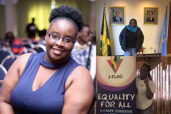
But Frith isn’t new to the LGBTQ+ advocacy scene; back in Jamaica, it was her entire career. She worked with Jamaican LGBTQ+ organizations JFlag, Color Pink, and WE-Change. “I’m glad that I was able to be part of that organization, but it’s also the reason why I am no longer in Jamaica,” says Frith. 

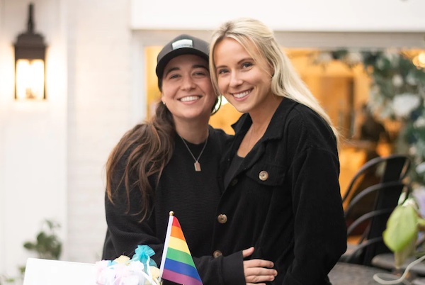
Virginia brought Frith more than just a job. It also introduced her to her partner, Kelly Richards. Richards also fled Jamaica due to multiple threats against her life as a masculine-presenting queer woman. Introduced by Frith’s uncle, Frith helped Richards build her U.S. asylum case. 

“I fell in love first,” Richard shares. “Her personality and willingness to help made me want to hold on to her.” 

From assisting her partner to becoming a mentor to new Rainbow Railroad refugees, Frith loves helping others bear the burden and stress of starting over. 

Frith remembers welcoming the first member of their program at the airport. She recalls him running to her and falling into her arms, desperately crying thank you over and over again. “I was just like, ‘Okay, this is it, like this is it.’ The hug was like a weight. I was able to take something away from him,” says Frith. 

After eight years in the United States, Frith’s asylum case is still pending. Nowadays, she connects to her Jamaican roots by eating Richard’s delicious curried goat recipes and listening to old-school reggae.

Increasing Queer Wellness and Mental Health With Coming Out Happy

By Abby Stuckrath

This article was originally published in Tagg Magazine here.

Growing up in a religious community in Colorado, Keely Antonio never imagined that she could lead a fully authentic life as a queer woman.

“A lot of my journey was suppressing who I was,” Antonio told Tagg. “I didn’t understand what it meant to free myself and step away from the judgment and the doubt.” 

Coming out as queer was the first time she truly listened to her body. “It really shaped my understanding of wellness and what it means to listen to your needs,” says Antonio. 

Antonio’s journey as a queer woman motivated her and her partner, Dani Max, to create Coming Out Happy. The company helps LGBTQ+ individuals become more fulfilled and empowered versions of themselves. 

Coming Out Happy originally started as an LGBTQ+ rainbow mask project during the beginning of the COVID-19 pandemic in 2020. But one viral Instagram post quickly transformed the company into something more. 

“I made a video saying that my partner is doing great things for the LGBTQ+ community and that everyone should follow her on Instagram,” says Antonio. “It got hundreds of thousands of views and hundreds of people to join the membership program.” 

In an effort to connect and support queer people during a time of such stifling isolation, Coming Out Happy evolved into a community-based membership program where Max and Antonio provided life coaching and therapy sessions. 

The pandemic taught them how important fostering and creating community is, “especially in a society that’s so individualistic,” Antonio says.

Coming Out Happy has now served 200,000 queer adults across the world. The company now offers wellness support through podcasts, workbooks, live coaching sessions, and virtual programming.

Last summer, their online network and services finally added in-person events. The San Diego Self Love retreat was their first in-person venture. Antonio says that participants flew in from all over the country for a weekend of intentional yoga, group discussions, and “the most queer joy that you could imagine.”

To foster a more diverse and inclusive space during in-person events, Coming Out Happy offers a BIPOC scholarship program. They funded four full-ride scholarships for the San Diego retreat. Earlier this month, Antonio and Max held another successful event, their Winter Queer Leadership Camp. 

Additionally, for those unable to attend their in-person events, Coming Out Happy offers a virtual program called the “Pride Amplified Six Week Course.” The website describes the course as an “​​On-demand program for queer adults designed to help you ditch insecurities, connect with the most confident version of yourself, and create a solid foundation for healthy relationships.” 

Antonio recalls one of her most memorable patients from her course, a 50-year-old woman who recently left her husband. After a decades-long heterosexual relationship, she was eager to explore her queerness. 

“She came in with a lot of shame and didn’t know how to join the community,” says Antonio, who works as the woman’s therapist. 

Years later, she has created a blooming network within the LGBTQ+ community and started her own queer-centric business. 

“It was so amazing to see her tap into her community and relationship and go and make an impact,” beams Antonio. 

Antonio shares that beginning your journey in self-empowerment can start with finding just one person to connect with. “Sometimes we don’t have all the resources; it’s just one door and one person,” she says.